Case study — Concept

Ostra Studio

A calm, editorial website for an architecture and interiors practice in Copenhagen.

Visit live site (opens in a new tab)
Type
Concept
Scope
Design, build
Stack
HTML, CSS, GSAP, Lenis
Year
2026
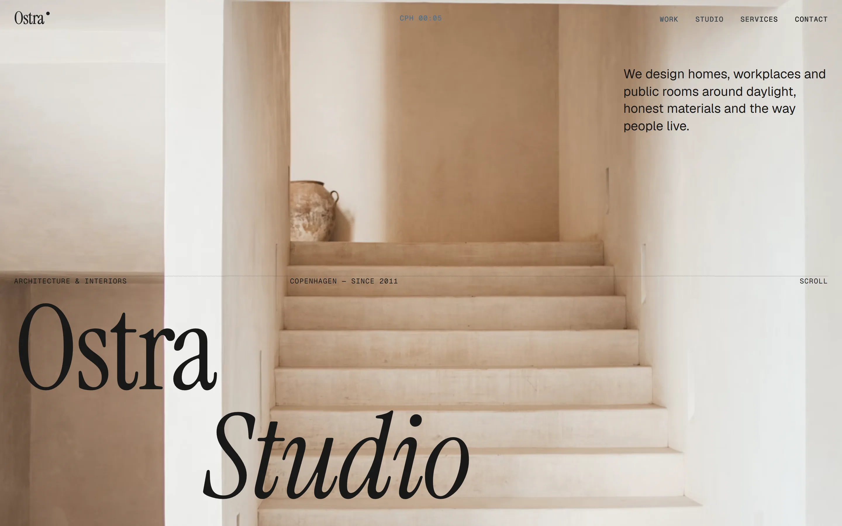
Ostra Studio home page on desktop: the name set in a large serif over a photo of a pale stone staircase, with a short line about daylight and honest materials

The brief

Show what a studio site can feel like when it's built rather than assembled. Quiet, confident, fast.

Ostra is a concept: an architecture and interiors practice that needs a site as considered as its buildings. No template, no page builder, no stack of plugins. Large type, real whitespace and motion that waits for the reader.

Every page loads only what it uses. The words are readable before any script runs, and the motion is a layer on top, never a gate in front.

Design decisions

  1. 01 — Typography

    Instrument Serif at 14vw does the work a photo usually does

    One serif, set very large and tightly spaced, carries the mood. The photos can stay small and few, which keeps every page light.
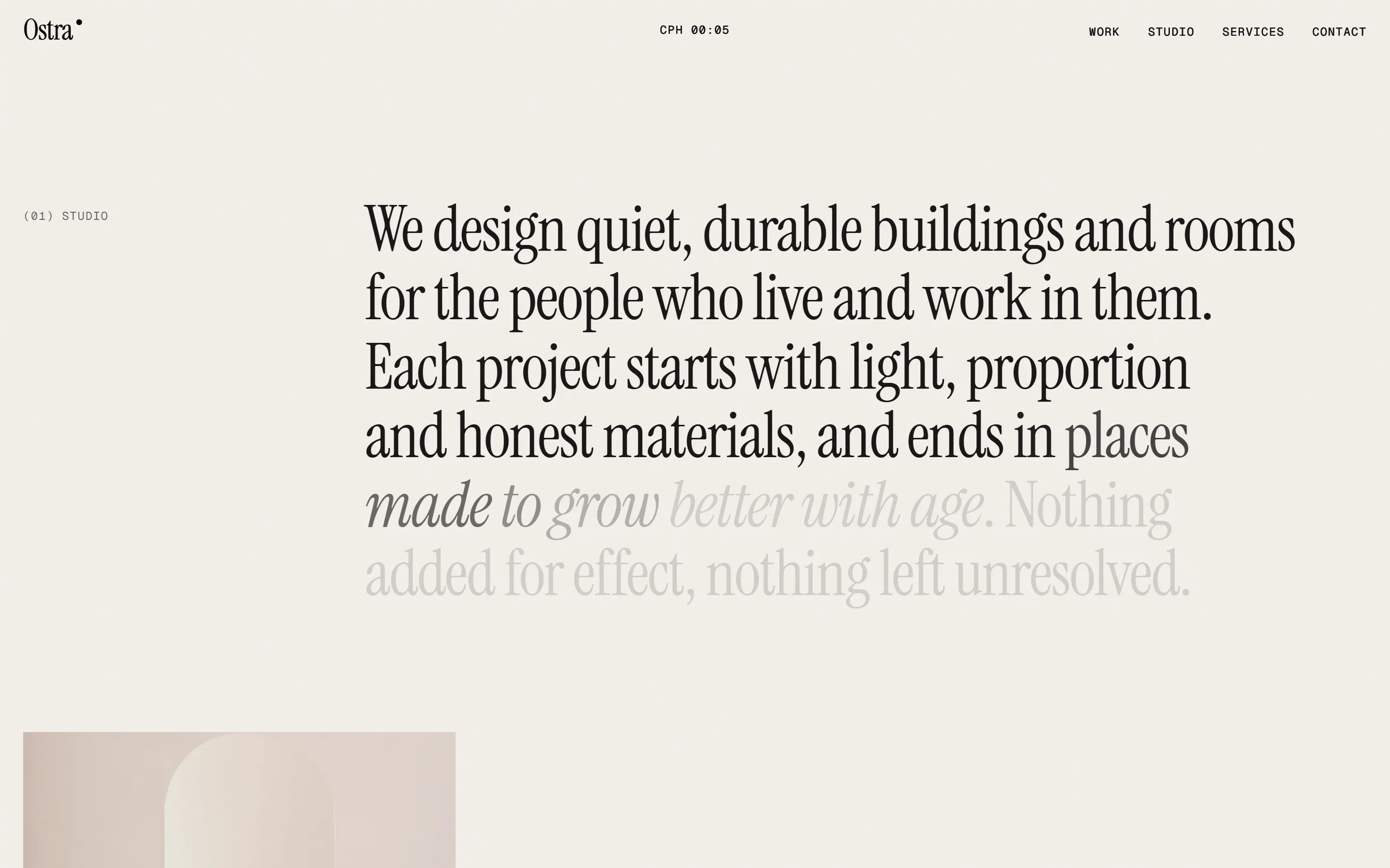
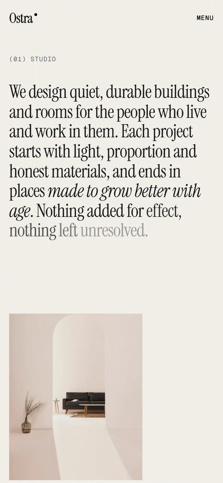
    Ostra studio introduction on desktop: a paragraph in a large serif that fades from ink to pale grey as it is read
  2. 02 — Colour

    Bone, ink and one clay accent

    Warm off-white pages, near-black type and dark sections, and a single clay tone saved for the one thing that should be pressed.
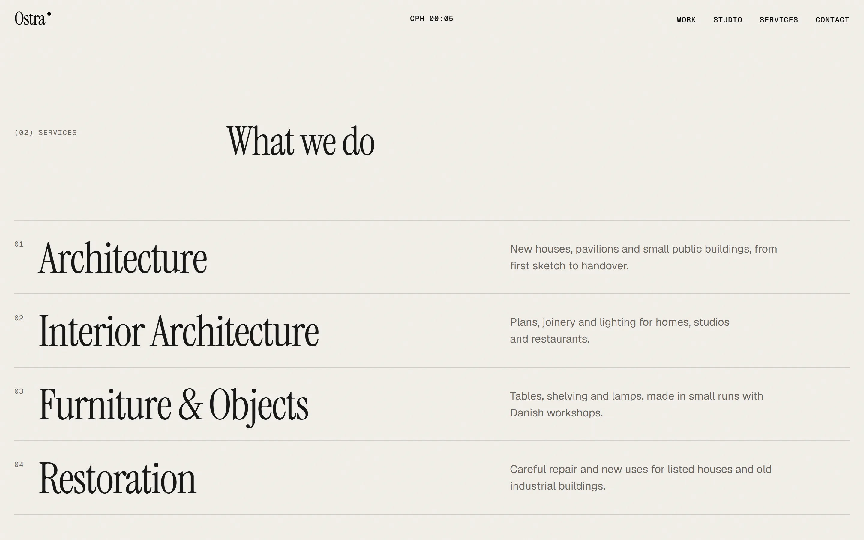
    Ostra services page on desktop: four services listed in a large serif on a bone background, separated by thin rules
  3. 03 — Motion

    A pinned sideways gallery, line-by-line reveals, a footer that's uncovered like a curtain

    Three moves, used the same way on every page, so the site feels choreographed instead of busy.
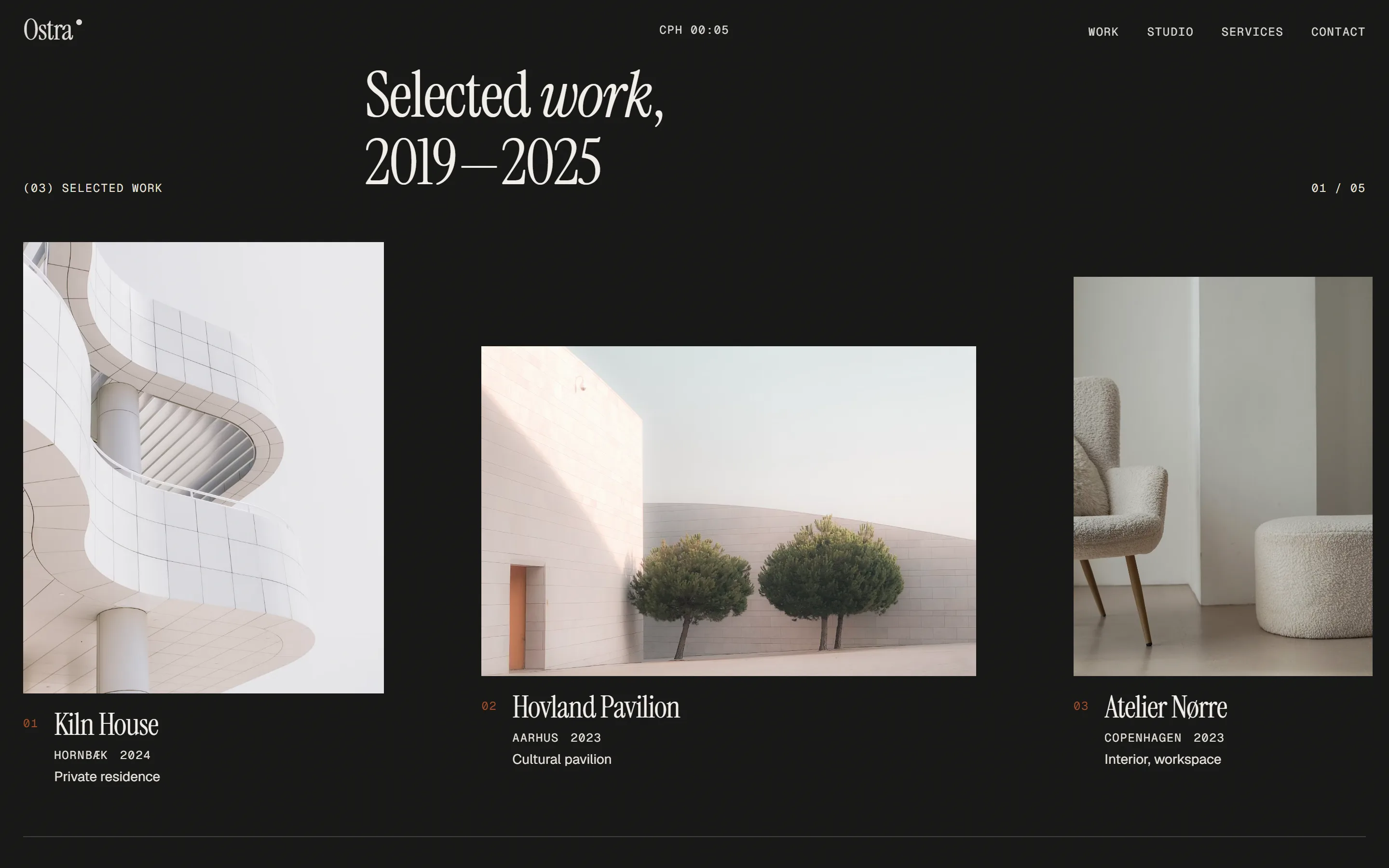
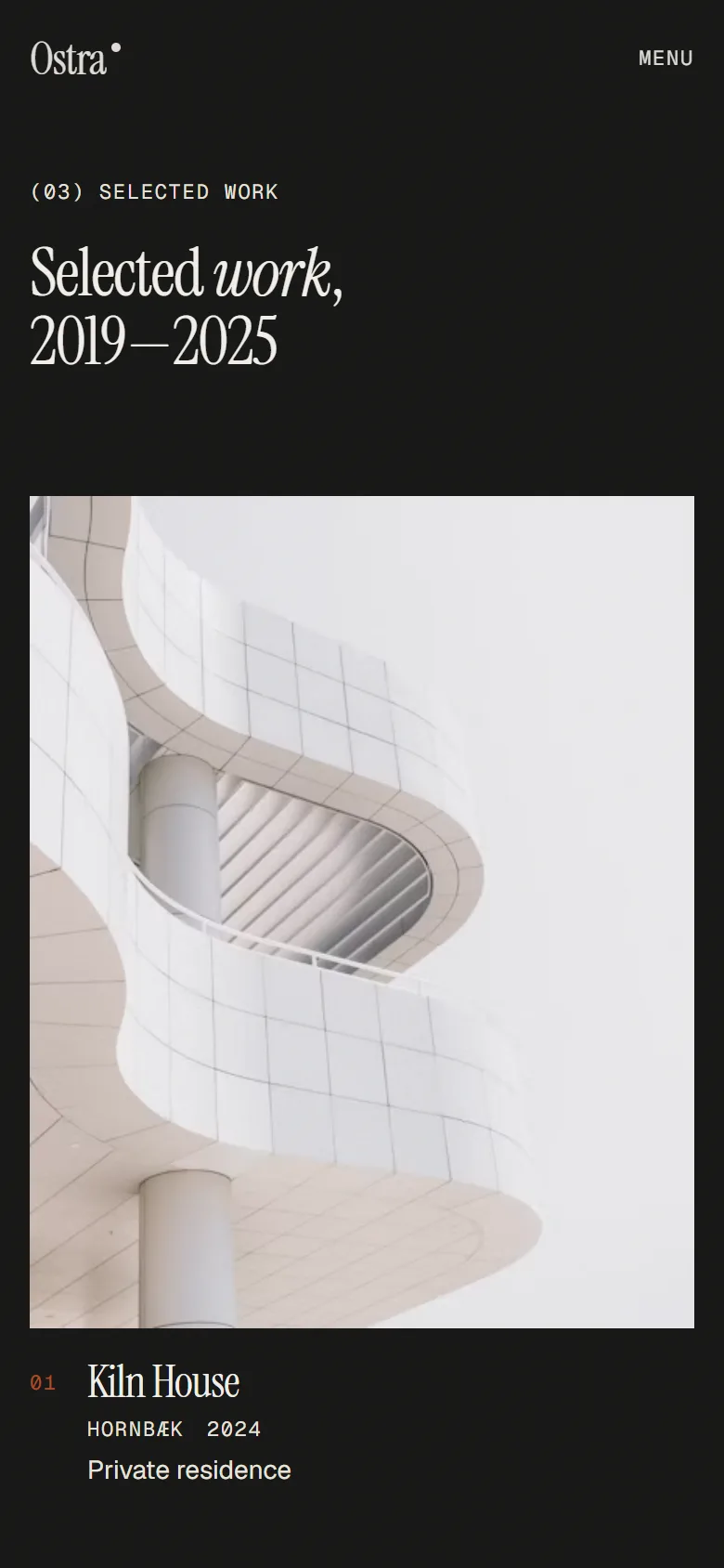
    Ostra selected work on desktop: three project photos in a sideways gallery on a dark background, each with a name, place and year

Screens

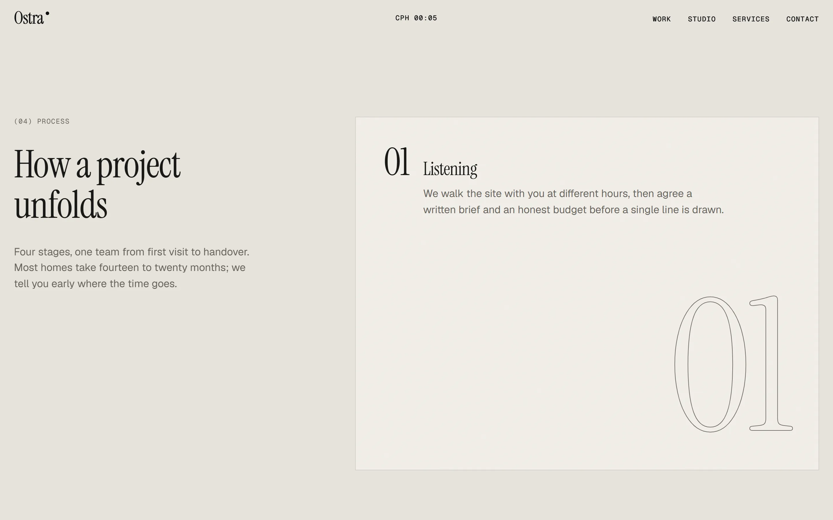
  • Ostra process section on desktop: the heading How a project unfolds next to a card for step one, Listening
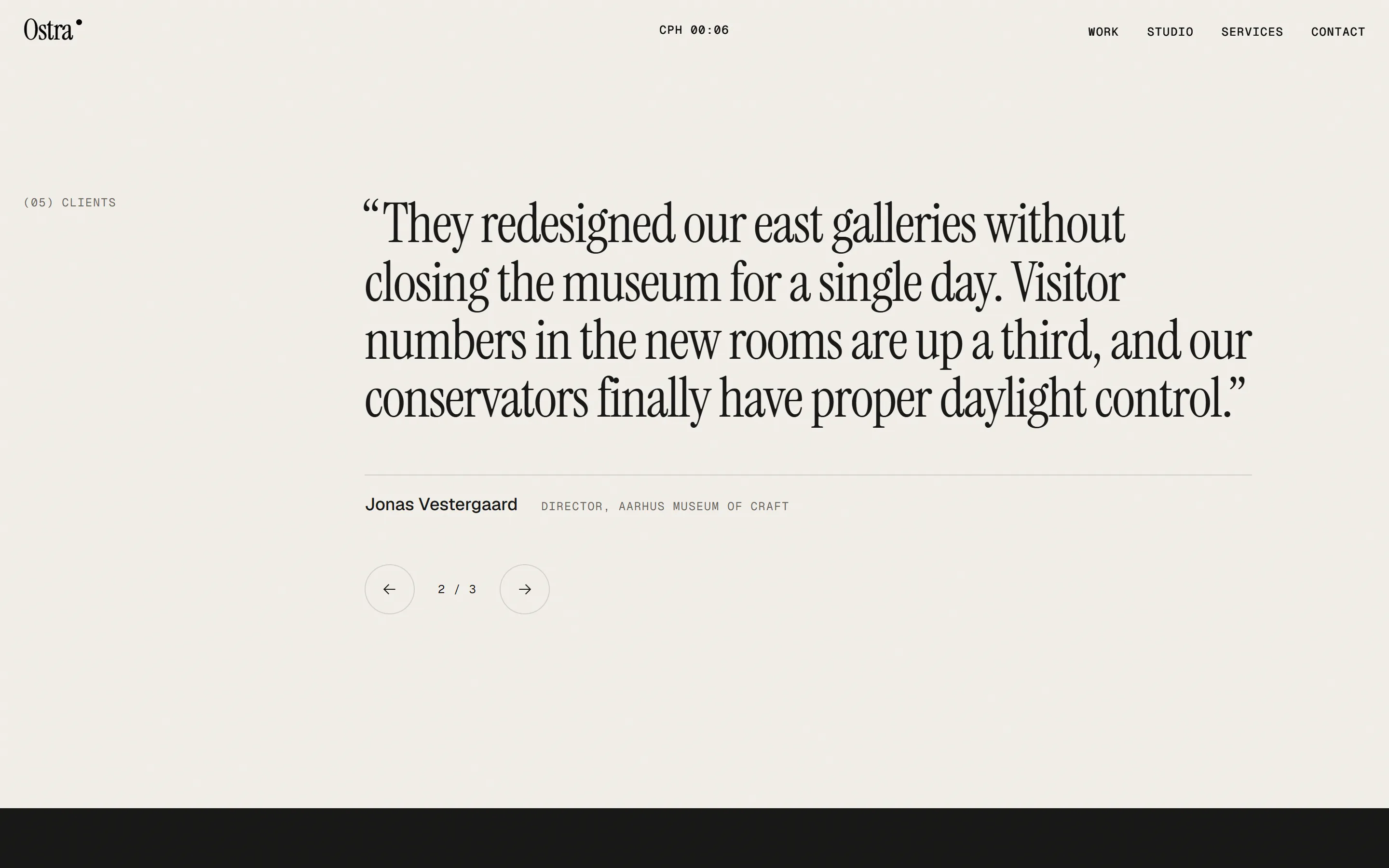
  • Ostra client quote section on desktop: a placeholder quote in a large serif with arrow buttons to page through
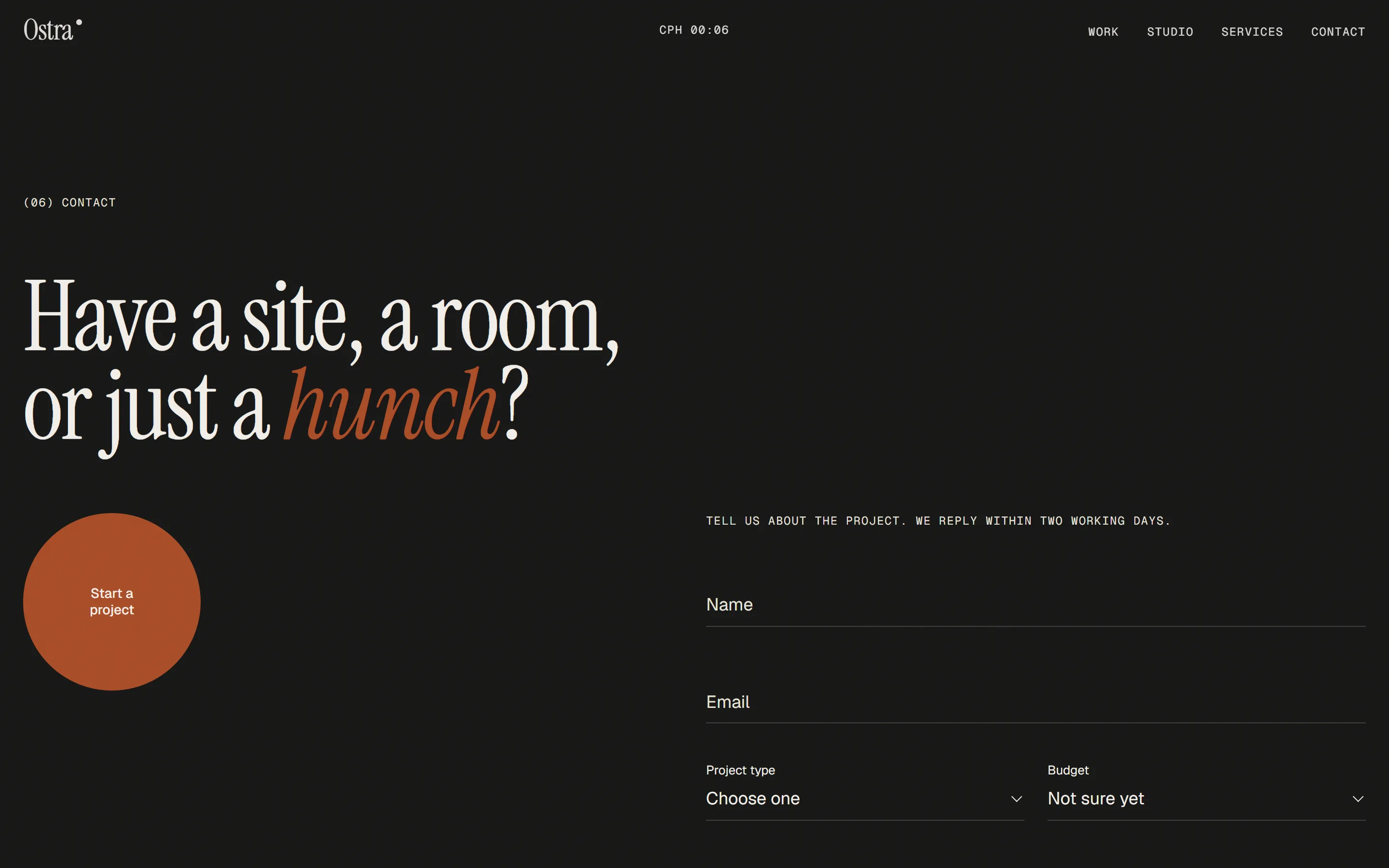
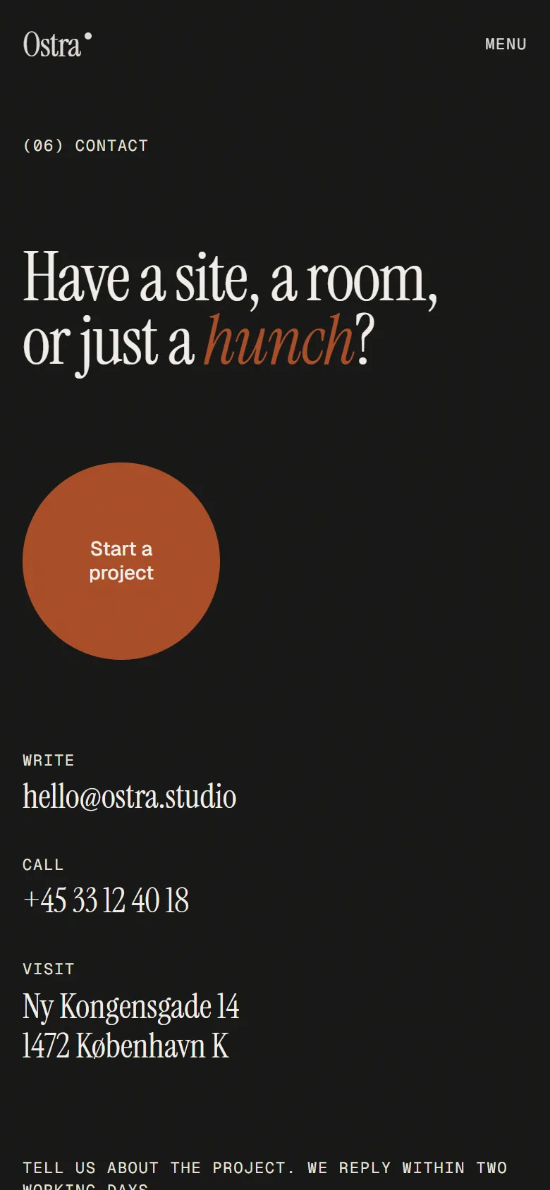
  • Ostra contact section on desktop: the headline Have a site, a room, or just a hunch, a round clay button and a project form
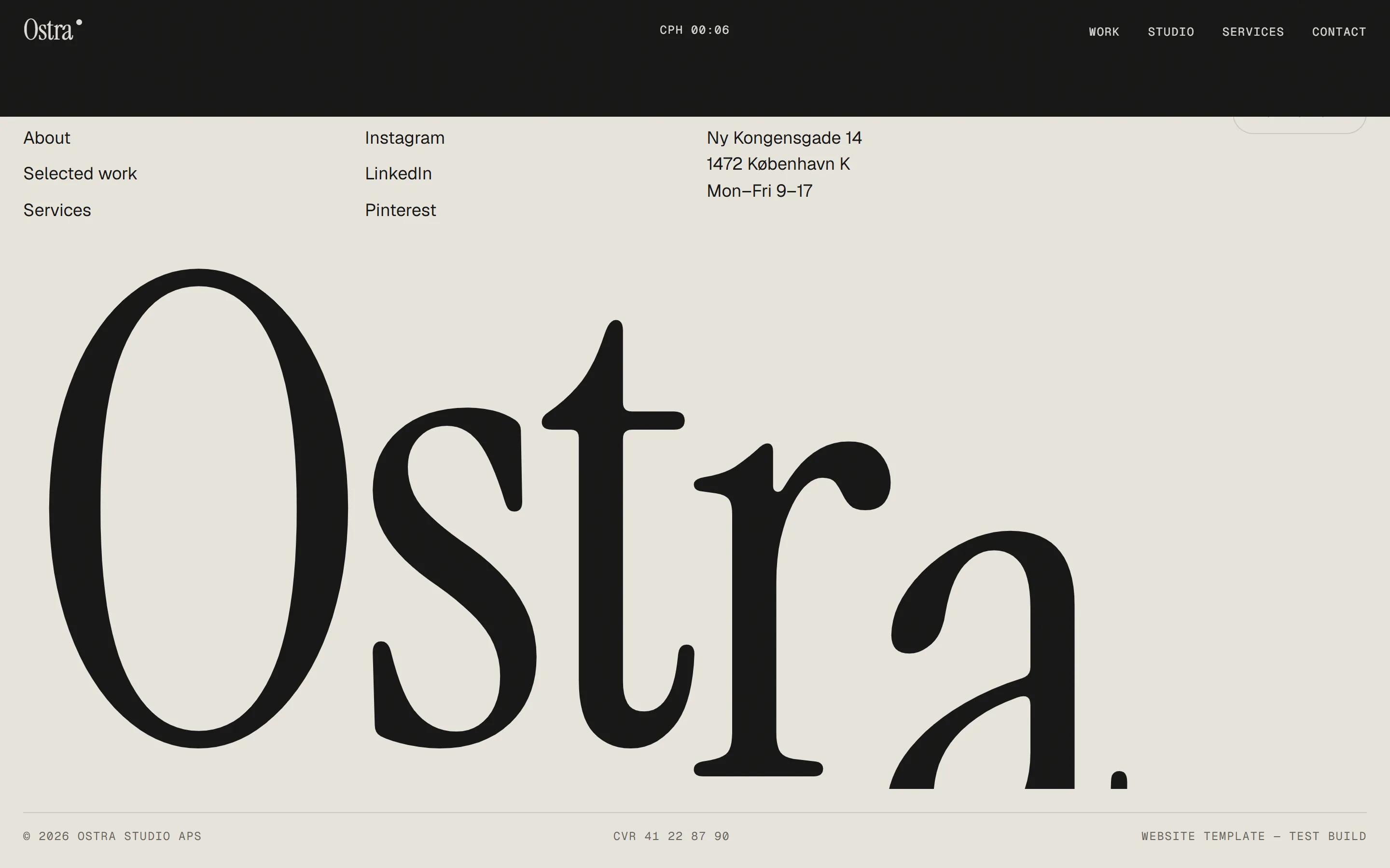
  • Ostra footer on desktop: link columns above the name Ostra set across the full width in a huge serif

Mobile

Designed for the phone first. The same calm, one thumb away.
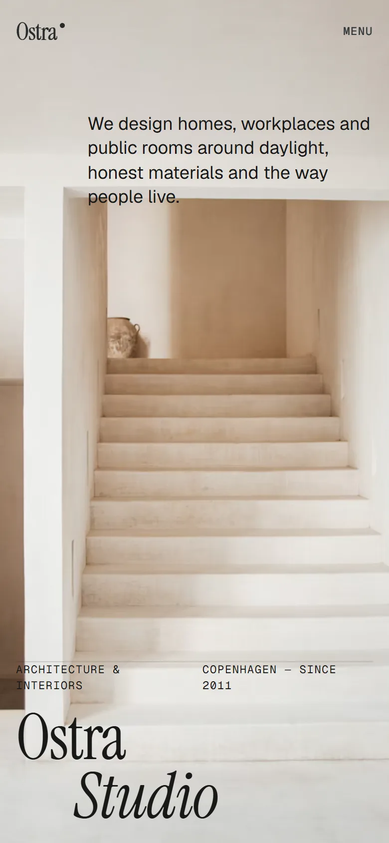
  • Ostra home page on a phone: the staircase photo fills the screen, with the name in a large serif at the bottom
  • Ostra studio introduction on a phone: the serif paragraph above a photo of a pale arched room
  • Ostra selected work on a phone: a tall photo of a curving white building above the project name, place and year
  • Ostra contact section on a phone: the headline, a round clay button and the studio's email, phone and address

Under the hood

  • No framework, no page builder
  • Readable with JavaScript off
  • Respects reduced-motion settings
  • Tested with 78 automated checks
Next — Halfstep Studio